I guess, I am asking everyone for their thoughts and opinions on the new look but in the end...the ad is already sent and the deadline has come and gone so I will be unable to make any further changes. I did make an arrangement with Kim for my second ad to be 50% off so if through suggestions, I can certainly change the look or feel come the next time around. The previous ad that Alyssa made for me was fantastic and showed everything that I made at the time which is how I needed people to know that I my company was out there. This new ad is more sleek, clean and hopefully mysterious enough that people will either scan the QR code or look up the website address due to the vagueness of the whole thing.
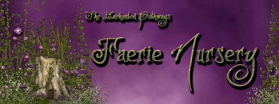
Under the suggestions of all of us, Larry, Matthew and Brandi the stump island photo was developed (well, Matthew disagreed with the whole stump idea as he noted that I am not in the business of selling stumps...I commented back with...well not yet!!). The look we were hoping to achieve was one that showed a faerie door and perhaps if you looked you might be lucky enough to catch a glimpse of a faerie in amongst the flowers and grasses. I think Schonee did an amazing job of capturing a mystical playground for the faeries.
With the company ever evolving and changing, this ad will allow me to add and subtract products without changing the look and feel of the new backgrounds. The stump island photo is now on every banner for all 6 of my e-commerce sites as well as the website, Facebook and my blog page. All printed material is in the process of being changed over as well. We stayed with the original company colours of eggplant purple and green which means none of my packaging products will need to be changed which helped with expenses.
Thanks for reading and please respond if you have any suggestions...
Faerie Amma (Emmanuelle) :)


No comments:
Post a Comment